- Public Policy
- Leadership
- Funding
- News & Events
- About the Center
Back to Top Nav
Back to Top Nav
Back to Top Nav
Back to Top Nav

As part of MLDP, we encourage students to take advantage of the Rockefeller Center's bonus content, which can be found on our Pinterest page by clicking here. We hope students can use the bonus content as a way of learning about real-life examples that draw on the material we teach in the program. For more information about MLDP, click here.
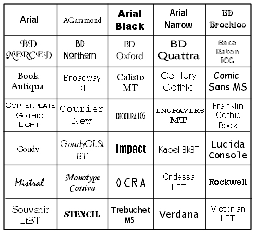
Scott Schwertly’s article 5 Typography Tips for Every Presenter is a brief, yet important reminder on the essentials of any well-written business communication. His article also serves as a wake-up call to the power of typography, saying, “the sad reality is that even though today’s presenter has control over type, most don’t quite understand –much less utilize – it is an art form.”
Schwertly captures the ways typography can be used to subtly improve and enhance written communication, which boils down to three main concepts: formality, boldness, and simplicity. While formality, i.e. following a business’s template, is important in adhering to established protocol, simplicity is the most crucial element.
In the age of flashy PowerPoint templates, presenters easily find themselves faced with the temptation of using fancy fonts in order to amaze audiences. Unfortunately, this vision of an audience captured by one’s usage of ye old English penmanship falls flat when people are scratching their heads, confused about what is written on the current slide.
The importance of simplicity is not limited to formal presentations. When writing proposals or email requests, people expect streamlined, brief communications. While most people do not consider fonts when they are used correctly, people do notice when fonts are used incorrectly. A difficult to read font is frustrating and makes one want to chuck the entire work into the waste bin. Devoting a few extra minutes to selecting the appropriate font prevent a phenomenal presentation from becoming a mediocre one.
--Written by Alexandros Zervos ’16 , MLDP Participant Fall 2013