Read a student's account of our most recent session in our Management Leadership and Development program below. For more information, about MLDP, click here.
 |
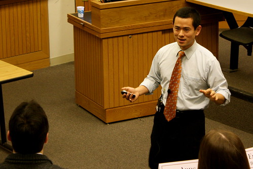
| This past Tuesday, MLDP students participated in a session set up by David Uejio on Presentation Design. This session introduced a design approach to presenting information and gave students the opportunity the practice the techniques David Uejio spoke about. |
What goes into making an effective PowerPoint presentation? Today in MDLP, speaker David Uejio answered this question in his presentation about “Design for the User Experience.” People rely on PowerPoint for communicating ideas and presenting material in both classroom and work, however, simply typing words on slides is not enough to create an effective presentation. Uejio opened the seminar by discussing 3 key steps to designing a presentation:
1) Design for them.
2) Design for you.
3) Mindhacks.
When making a presentation, it is important to begin by designing for the audience and caring about their experience. Uejio used Disney and Apple as examples of businesses that put a lot of energy into designing a complete user experience. Make sure you know whom your audience is and why they are listening to you. Ask yourself, “Why are you here?” because that is exactly what your audience will be asking at first. Think of ways to deliver your message and important information in a way that will be remembered by your audience.
Designing for yourself is often underrated, yet just as important as designing for your audience. Set up your slides in a way that you can navigate. Identify how many key points you want to cover to make sure that you will be able to successfully convey the most important information of your presentation. Organize your presentation so that you have a defined beginning, middle, and end. And always keep in mind, that part of designing for yourself is making sure that you do not pick things that are super complicated (ie, if you include a video in your presentation, make sure you know how to work it).
After designing for your audience and yourself, think of “mindhacks” that you can incorporate into your presentation. For example, everybody loves quotes! If someone else can say something well or better than you would say it, then just take his or her quote and site it. Stories are also a great tool because they are much more compelling than listing boring data that your audience will tune out. While stories are not generally used in presentations, you may want to consider using one as a way to connect the message you are trying to convey on a more personal level, when applicable. Images are also great means of using similes and metaphors to make your point. However, the problem with images is that people use them inconsistently; make sure your images have high resolution and are sized properly. And lastly, video is becoming a more and more popular to incorporate in presentations. [Note: check out Prezi.com for a high technology alternative to power point].
Next, Uejio talked about both graphic and narrative design. Uejio reminded us, “Just because you do not go to school for it, doesn’t mean you can’t do it.” Everyone is capable of making effective graphic design in his or her PowerPoint presentation, as long as time is put into it. Some key considerations when thinking about graphic design are font, palette, whitespace, and images. Pick a font that makes sense for you (not a crazy one!). Nothing is wrong with black and white, but try checking out kuler.adobe.com for some cool palates. In regards to whitespace, remember it is sometimes more effective to have fewer words, and more white space to give your audience space to breath. Also, bullets might help eliminate words. Things to avoid for graphic design: animation, clip art, vertigo inducing transitions, and Comic Sans Ms.
Narrative design is as important as graphic design because it is how you are going to convey your message. Successful narrative design is a result of being succinct, articulating, being minimalist, storytelling, and sequencing. Failure in narrative design results from using too many words on slides, rambling, and reading off slides while presenting. Great presentations come back to great writing. Think about the greatest speeches ever written (for example, The Gettysburg Address)—they were not delivered with a PowerPoint. PowerPoints are not necessary to convey a message, thus make them add something to your presentation if your are going to use them!
Lastly, Uejio recommended some great resources to get you thinking about both graphic and narrative design:
· Presentationzen.com –Blog from a pro that gives free advice on presentations
· Guardian datablog—Stylized charts that are interesting to look at; shows cool ways to look at information being presented
· Slideshare—Tons of slide shows
o You can look and see what you like and don’t like to form opinions about what works for presentations
All of these resources will help get you going to design for the user experience by yourself!
-Rachel Bornstein '14
